Giving up Geomanist

This content was posted over 2 years ago and is most likely no longer relevant.

This is a pretty design-orientated post, so if you’re not into that, it won’t make sense.

Before we start, there are some specific definitions to the words I’m using here. Most people use these words interchangeably, but I’m going to try and use the correct terms in this post.

Typography – how text is arranged in a design.

Typeface – a design feature set for letters, including things like the shapes and whether it has serifs. If you’re using a word processor, this is the name that you see when you choose what your text looks like on the paper.

Font – a variation in the weight and size of a typeface. Using the same word processor example, this is whether your text is size 12, italic or bold.

After spending some of my professional life working as a visual designer, I find that typography has become important to me on my personal projects as well as my professional ones. It’s both a blessing and a curse to open up a page and find oneself wondering if the kerning is too much as opposed to reading the content on the page. And let’s not get started on the overuse of a certain comic-based typeface in printed media when there are far more accessible alternatives.

Anyway. I have a very particular way I like typefaces to look. For screen use, a sans-serif typeface with simpler shapes will be easiest to read on a variety resolutions and device types. Each of these typefaces needs a good subset of fonts – my works make use of both bold and thin weights as well as sections in italic. A typeface which doesn’t have these font styles isn’t going to cut it for me.

serif vs sans

When I choose a new typeface for a personal project, I look for several key things:

  • Is it readable on a variety of screens and systems? For example, Windows will render typefaces in a different way than macOS.
  • Is it accessible for all users? Users with dyslexia may find it harder to read certain typefaces.
  • Does the font have different weights and styles?

And finally:

  • What does the lower-case letter g look like?

This final point is almost always the decider for me. Call me pedantic or snobby, but when I write the lower-case letter g, I don’t like adding a neck or a loop to the character. It feels excessive and increases cognitive load when reading.

g character with loop

Over the few iterations of design my site has had, the typeface and fonts have always been one of the first things I look at, trying out a handful to see how they work on a proposed layout. Google Fonts is usually a good place to start when working with prototypes, especially if the prototype is HTML. It lets you swap entire typefaces with a single line of code.

A few years back, I found that I couldn’t find any typefaces that fit any of the criteria above that worked well with the site design. The only way to fix this issue was to spend some money on a typeface which had a permissive web license. I settled on atipo’s Geomanist family.

a sample of the Geomanist typeface

As the name implies, Geomanist is a geometric sans-serif typeface. In simpler terms, it’s a typeface based upon simple geometric shapes like squares and circles that doesn’t have extensions on the end of strokes.

Geomanist quickly became part of the brand for my web materials, encompassing my portfolio, side projects and other unrelated things that lived on my domain. Its simple shapes and relative ease of reading on screens meant it it worked out as a drop-in replacement for areas of my site that used different typefaces.

Since then, the web has changed and web typography has matured significantly. All major browser vendors support it and digital foundries offer up vast catalogues of typefaces. One thing that I’ve started to notice in the last few years is that Geomanist has a condensed appearance when compared to other fonts – that is to say, it feels like the letters are a bit too narrow when set in paragraphs of text. It’s not a huge problem, but it has started to irk me somewhat now we’re entering an era with high resolution screens on even the smallest devices we own.

But changing one’s brand is hard, especially when it’s something as central as a typeface. Many companies have recently tried updating their core brand typefaces, with mixed results. The only reason to change Geomanist would be if the replacement offered better readability.

I’ve spent the last few years looking at alternatives to Geomanist and until recently had never found anything better.

a sample of the two typefaces

If you’re looking at those two examples and thinking “but there’s no real difference” then it means this was a success. The fonts are so similar that the brand is kept, but the text on a page is slightly easier to read. The lower one in the image is Nunito Sans – a typeface I’d tried in the past but for some reason didn’t use. It has similar letter structure and shape while being less narrow. I find it is easier to read in larger paragraphs such as on this journal. I feel the sizing of the characters in Nunito Sans is a lot more consistent and the permissive licensing lets me use it throughout the site.

All these words to say “I’m changing Geomanist to something that looks similar but is more readable.” The change is rolling out to all pages of my site now so you might already be reading this in the newer typeface!

A 2020 retrospective

This content was posted over 2 years ago and is most likely no longer relevant.

If there’s one thing that the pandemic and underlying health issues have taught me, it’s that I miss the outside world. Going out, exploring the wonders of nature or taking some time to venture round man-made structures — it’s something all of us have been unable to do for much of this year.

a hand-drawn stylised view of a river

In a year that has been made up of suffering and lockdowns, it’s very hard to look back and see any positives. The world is in a strange place right now and I can only hope that the future holds positives we can look forward to. The year of human malware has taken its toll on everybody and my thoughts and good wishes are with those who have been affected by the virus, and those who are on the front line fighting to stop it. There has also been much back and forth on the topic of Brexit, which has rapidly become a term I am fed up of hearing. However, as the final hours of 2020 tick by, there are a few glimmers of hope on the horizon: a vaccine for COVID-19, a deal for moving the UK’s relationship with Europe forward as well as a new President for one of the most powerful countries in the world.

But the world is a big place, and there’s very little I can do to change it on my own. Since this is a personal journal, it’s probably easier to look back at what made up the last 366 days where I am. As usual, I want to thank my friends and family for putting up with me being there for me this year. I know that this time last year I felt like I had so much to look forward to but 2020 ended up being the eternal month of March. I haven’t been as open about things as I could have and I’ve not achieved as much as I could. I’ve kept myself to myself this year, not wanting to be a burden on anyone by sharing very much as I know we’ve all been hit hard by events which I haven’t wanted to add to. Things won’t magicaly stop at 23:59 tonight just because a number has changed so I’m not holding out much hope for the first part of 2021 either.

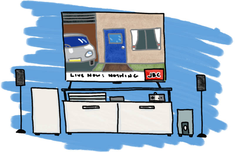
a hand-drawn television screen

I have spent this year dealing with health problems that have arisen from the operation I mentioned in last year’s retrospective, which includes a fairly unsuccessful repeat operation back in September. I was told yesterday that I will need further, more serious operations in the new year as the infection is either returning or spreading. It’s weird realising that I’ve been dealing with this for well over a year now, and it has taken its toll on me as a person far more than the human malware lockdowns or ever tightening work deadlines: needing to visit the doctor three times a week for several months has had the side effect of leaving me a bit numb to things happening around me.

On a more positive note, I spent the majority of the first few months of the year (i.e. pre-lockdown, if anyone remembers those days) gathering together materials and evidence to advance my career and, as of November, have been promoted to senior grade in my organisation. One could say that it took me too long to get here as I have effectively been working at a senior level for the past few years, but it is definitely a notable milestone and a big personal achievement.

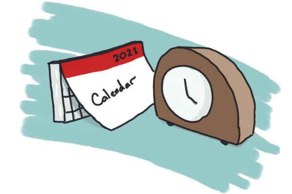
a hand-drawn calendar and clock

So what happens now? Usually I’ll end a post like this with a short paragraph on what I’ve learnt and how to move forward, but considering I haven't really left my house this year apart from going to doctors, I don’t feel that I have learnt anything. I haven’t achieved any of my resolutions for this year and I’ve been unable to do things I’ve wanted to do like travel.

But that’s not the full truth, is it? I know that there are times when it just feels like nothing is going your way and the world is just dull and grey — but just because the world around you is falling apart, it doesn’t mean you have to give up too. When I look back at this year, there are definitely some things I can be happy about. I’ve made some new friends who have shared their lives with me through the internet. I’ve kept in touch with old friends and the people who make my days better. I got a promotion, rebuilt my computer and still managed to do things that have meant a lot to me. There is always an opportunity to be better next year.

2020 was a hurdle. There may be more to come, but that doesn't mean I, or anyone else, should stop moving.

A 2020 Christmas message

This content was posted over 2 years ago and is most likely no longer relevant.

Usually at this time of the year, I look back at things that have happened over the last twelve months and reflect on what's happened and what can be learnt. With everything that's happened this year, I thought I'd do a little extra post for Christmas.

Firstly, I want to thank my friends, family and colleagues for all their support over the year. I wouldn't be where I am without you all. It sure has been a heck of a year and the world's problems won't suddenly disappear when the clock strikes midnight on December 31st — but with you around, I feel there's hope.

I hope you all can spend some time for yourself and with your families. Merry Christmas!

The story of a system

This content was posted over 2 years ago and is most likely no longer relevant.

A few weeks back, one of the hard drives in my computer started behaving erratically. Concerned it was going to fail, I took a full backup of it and removed it from the computer. The drive has been going since 2013 so it’s probably time for it to fail anyway but it got me thinking; the computer’s been around for a while, is it still set up as optimally as it could be?

My first attempt at building a computer was right back in my last year of university. I’ll admit I had no idea what I was doing; the majority of the components were donated by a close friend and all I did was put them inside a box. I had to buy a power supply unit and some disc drives, so I got a mid-range Corsair power supply and eventually a pair of 2TB discs for “future proofing”.

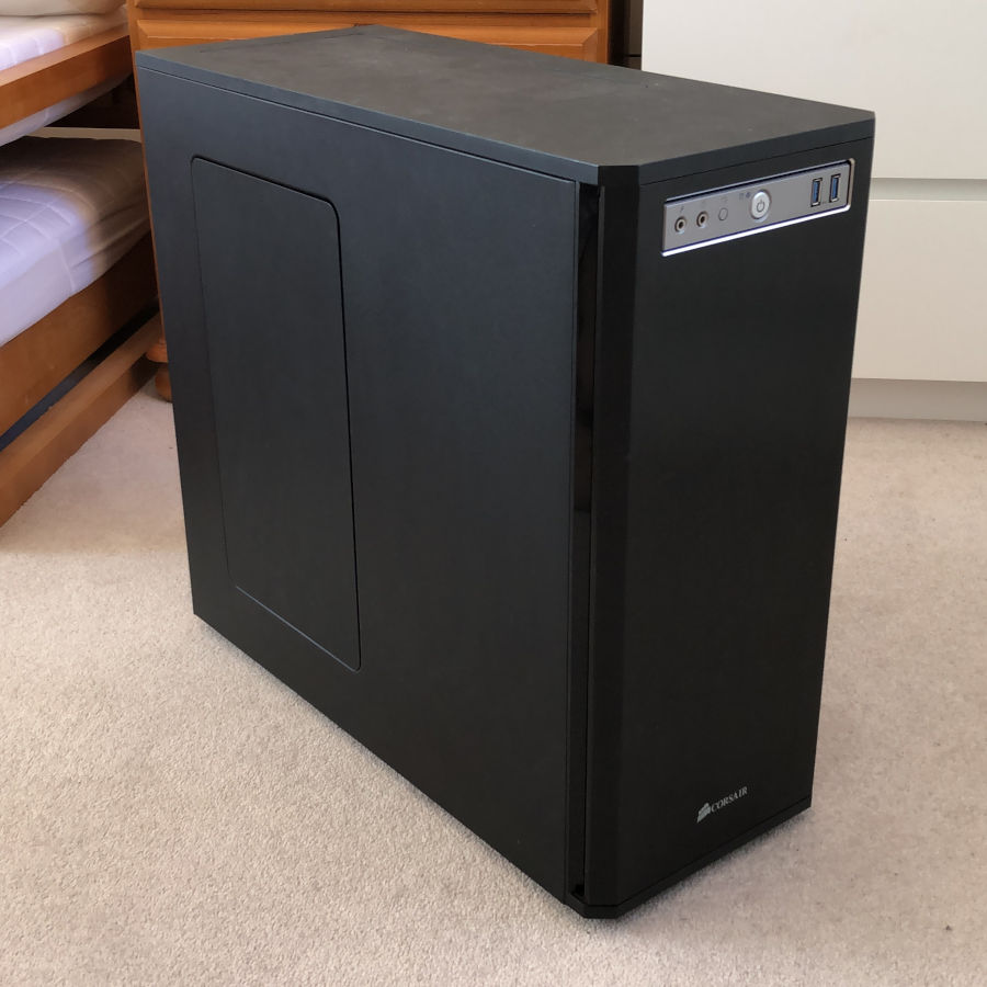
In late 2013 I decided to start again with my own components. I spent a lot of time comparing parts and picking out items that would make a decent everyday machine while keeping it quite future-proofed — I recall using the motto, “a decidedly mid-range machine” at the time. In January of 2014, I purchased the first parts of the new build: an Intel fourth-generation Core i7 processor and a motherboard to match. In February, I purchased a Corsair Obsidian 550D case — an oversized case with sound-dampening elements built in to make the resulting machine quieter than its predecessor. I took the graphics card, power supply and the two hard discs from the other machine and set the whole thing up as a brand new computer. This was the beginning of the machine I now call Skye.

Corsair Obsidian 550D computer case

Skye has been with me through a lot since early 2014. Originally, she had no name other than “the Windows computer” and was the obscenely powerful companion to my laptop — in fact, I only really started calling her Skye when I replaced the laptop and called that Pulsar. While I still consider this computer the same one as the one I pieced together in 2014, there’s actually very little left which was present back then. The only parts that have been consistently used since Skye came into existence are the ridiculously oversized CPU cooler and, until recently, the power supply unit. She’s moved house three times, seen me take on several new roles at work and upgraded through several versions of Windows: one of which wiped both the hard discs and caused me to scrabble around with data recovery software for far longer than I wanted to. I’ve been quite impressed at how resilient and stable everything has been during this time, even with the minor replacements that have happened along the years.

I’ve also used some pieces of other machines for purely nostalgic reasons. When I was growing up there were two computers that I spent a lot of time with. The first was our family’s first computer: a fairly small, nondescript tower computer made by Fujitsu in 1996. The other was a dark blue Toshiba laptop which I used throughout high school. Screws and washers from these machines still hold together hard drive bays and secure the power supply mount.

In 2018 I built a Home Theatre PC (HTPC) to put under my TV using only second-hand parts. Unfortunately, the second-hand store where I purchased the components for this machine sent me an incorrectly-labelled processor that was far too powerful for the HTPC. Instead of sending it back, I decided to upgrade Skye using this processor – a first-generation AMD Ryzen 7. This kicked off a slow set of upgrades, culminating with a new case that I bought for myself last month.

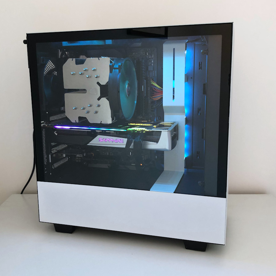
NZXT H500 computer case

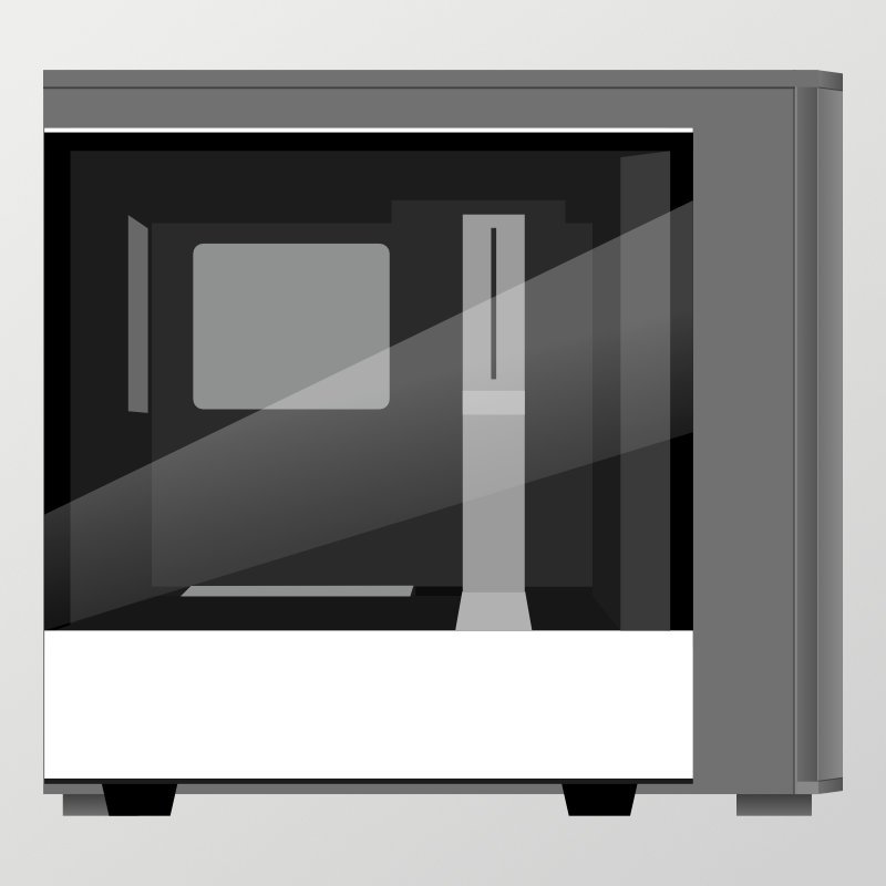
The old Corsair case was great for the amount of components I had originally. However the fact that I’ve upgraded almost everything meant not much of the case was being used any more – most of the hard drive bays left empty, the CD drive rack completely unused and most of the rear ports closed up. Therefore, I decided to splash out on a smaller case. I also wanted to show off the shiny elements I have acquired over the years – so I went for a second-hand NZXT H500i. It’s a bit smaller than the Corsair case and has far fewer moving parts, so I figured it would work better for this more focussed job.

Computer case dimensions compared

I suppose that this is the machine that will be carrying me through the first part of this decade at the very least so I guess freshening it up a little over the past two years will keep it going for a while longer. The H500 case isn’t supposed to be good with airflow, but the temperatures seem to be pretty stable in the middle of the acceptable range! I’ve spent weeks tweaking the way everything works with each other to end up with a system that both looks and performs way above its league, at least according to benchmarking sites:

Overall this PC is performing above expectations (76th percentile). This means that out of 100 PCs with exactly the same components, 24 performed better. The overall PC percentile is the average of each of its individual components.

No longer “a decidedly mid-range machine” I guess!


Footnotes:

Mini shunter updates

This content was posted over 2 years ago and is most likely no longer relevant.

The Class 09 shunter I rebuilt has had a few more tweaks added to it now it’s working properly again.

First off, I’ve put some weight into the locomotive — more weight means there is less likely to be any wheel spin when pulling larger loads. Since the model is mostly plastic, it doesn’t weigh much at all. Originally, it had a solid lump of lead placed inside it to weigh it down but this doesn’t exist in my model — and besides, lead is toxic. I picked up a pack of iron car wheel weights and placed a bunch inside. There’s now an additional 45g of weight just above the wheels.

Weight structure

The second change is that I’ve put in window glazing which gives a more realistic appearance to the cab.

Cab glazing